
Using Indicators For Confirmation
Some people use computer generated technical indicators for almost all their trading decisions. I’m not one to tell someone else how to trade or what to do. I can only say that I use these indicators as a “second opinion” in my trades. Now that I’ve said that, let me say that I think they can be a great second opinion. I use them on every trade I look at. You will probably want to do the same once you understand how to use them.
Before we get too deep into the indicators, I want to talk about Volume and Open Interest as they are prerequisites to the understanding of many other indicators.
Volume Indicators & Open Interest
Volume – One Of The Best Indicators Of All: Volume is important because it tells us a lot about the current trend. It helps us know if the trend is strong or if the trend is weakening. Usually, when the market is in a strong trend, either up or down, the volume will be up. The reason is that everyone wants to be on the bandwagon, so to speak.
When the trend starts to soften, people stop buying in an uptrend or stop selling in a downtrend. As a result, volume drops. Think for a moment on how to take advantage of this information. It’s pretty simple: if volume is up, the trend is usually strong and if volume goes down, the trend is usually weakening. Watch this like a hawk when you are trading in a trending market. It will give you a good indication of when you might want to get out of a trade, or look to get into the trade in the opposite direction of the trend, if volume drops and all else looks well.
Look at the following chart. As you can see, the volume was up and steady from February through June and the trend was still down. Steady, high volume indicates that the trend was still intact. Notice the big jump in volume in June when the price rallied up for two or three days. Right after that, the volume went to almost zero, because the public did not know what to do. Is the price going up, down or sideways? Until a trend develops, volume will usually stay down.
Even though the trend was down from last November and December, you will notice that there was not much volume at the beginning of the July contract. Why? It’s because in December 1998, the July 1999 contract was a little too “far out” (too many months ahead) to trade, and most people would have been trading the closer in months. Should you have wanted to trade the July 1999 contract back in December 1998, you could have been watching the volume on the front month in December, which would have been the January or February contract. I assure you, the volume during the front month was up.
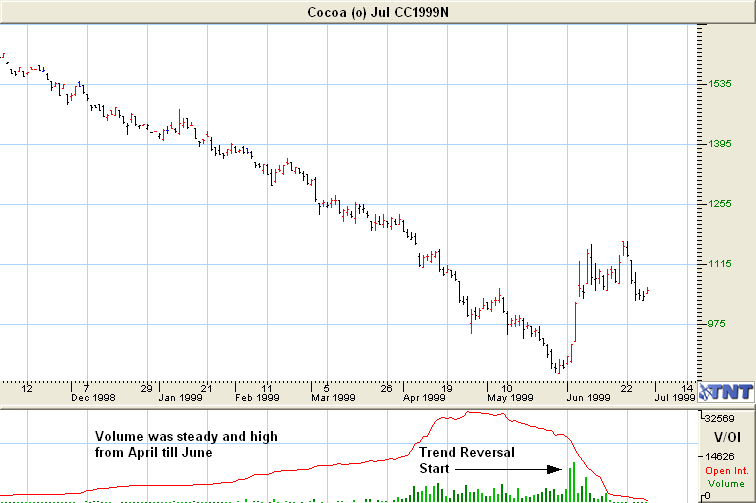
As you can see in every instance, when the volume was up, the trend was strong and when the volume went down, the trend was weakened or broken. When you are trading, keep a close watch on the volume. If it makes a drastic change, you might consider going flat (not having any contracts) until the market stabilizes and the trend confirms itself one way or the other.
During a time when the price is up and it’s “topping out,” the volume will usually lighten up during price rallies and increase during pullbacks. The reason is that the market is waiting for the trend to either confirm itself or for it to reverse trend again.
During the last stages of a downtrend watch for heavier volume during rallies and lighter volume during price dips. During breakouts, bullish breakouts in particular, there must be heavy volume. Notice on the previous Cocoa chart, when the downtrend was finally broken, we saw the heaviest volume so far for the year on this contract. Anytime you see a breakout to the upside that does not have heavy volume, be careful, as it may not last. This is the exact case in Cocoa on the previous chart. There is almost no volume after this rally, which makes me believe that the rally might not continue. By the way, if you look at a chart after this date, I’ll bet that the rally did not continue.
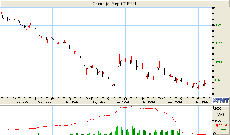
In the chart above, when the price rallied in June, notice how strong this upside breakout was. Look at the volume during that time frame. It’s high, and this indicates that the trend was strong. Then in July, the volume dropped, and so did the price. You could tell the trend was reversing by watching the volume, or lack of volume. Also, do you see a blip at the top of the rally in June? It’s a 4-day Blip, not a 3-day Blip by the way, another great indicator that the rally might be over. It also hit very strong resistance 3 times that month and could not break past it.
What’s the difference between Volume and Open Interest? The difference between volume and open interest is pretty simple. Volume is the number of contracts traded that day, both long and short positions and open interest is the number of contracts that are still active (open or unliquidated) for a particular contract.
Assume that someone bought 20 contracts one day and then sold (liquidated) 10 of them before the market closed the same day. His/her trades added 30 contracts to that day’s volume (20 bought and 10 sold).
Since he/she still has 10 contracts that are open, or still active, then those 10 contracts would add 10 to the total open interest for that contract.
Momentum Indicators
As the name implies, momentum indicators are designed to tell you the momentum of the market. They can help tell you when a trend is weakening or if the trend is strengthening. I use them quite often and will tell you as we go along which ones I use the most.
We are now getting into a difficult area here. Don’t be intimidated. You don’t have to understand the formulas used to make up the following indicators as any charting software will create them instantly. You will want to become familiar with some of them and what parameters to set each one.
At the end of each one of these indicators, I have written a little something about how I would use them in a trade, and have also included a chart or two for an example.
Stochastics:
Markets that are heading higher, tend to close near the top of the daily range while markets that are heading lower tend to close near the bottom of the range. Stochastics was invented by George Lane and attempts to measure this.
Stochastics is displayed on two lines. The main line is called the %K and the second line is called the %D which is a moving average of %K. Most of the time the %K is shown as a solid line and the %D as a broken or dotted line.
Hint: Think of %K as K for Kwik (quick), showing you the faster moving results.
Most people use one or all of the following methods to interpret this indicator.
- Buy when either the %K (lighter line) or the %D (darker line) falls below a specific level and then rises above that level. Sell when the Oscillator rises above a specific level. I use 75 and 20 in my software but many people use 80 & 20.
- Buy when the %K line rises above (crosses) the %D line and sell when the %K line falls below (crosses) the %D line.
- Many people look for divergence when prices are making new highs yet the Oscillator is not making or surpassing previous highs.
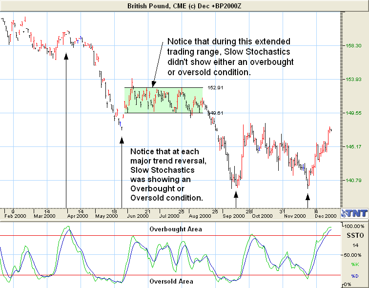
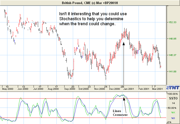
On the chart above, notice that at each trend reversal, Slow Stochastics was showing an overbought or an oversold condition. You can use this indicator to help confirm what you feel could be a trend reversal based on what the chart is showing you. Did you catch the Double Bottom?
Look at the previous chart in Mid-December. Based on Slow Stochastics, what do you think the price may do? What I see is that Stochastics is moving into the overbought area, and if it crosses over and begins to drop we might have a price reversal.
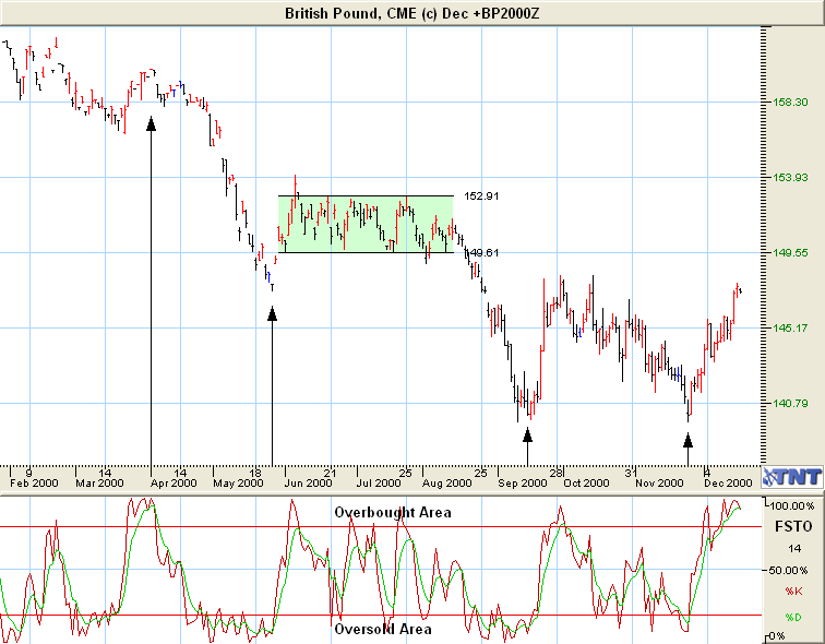
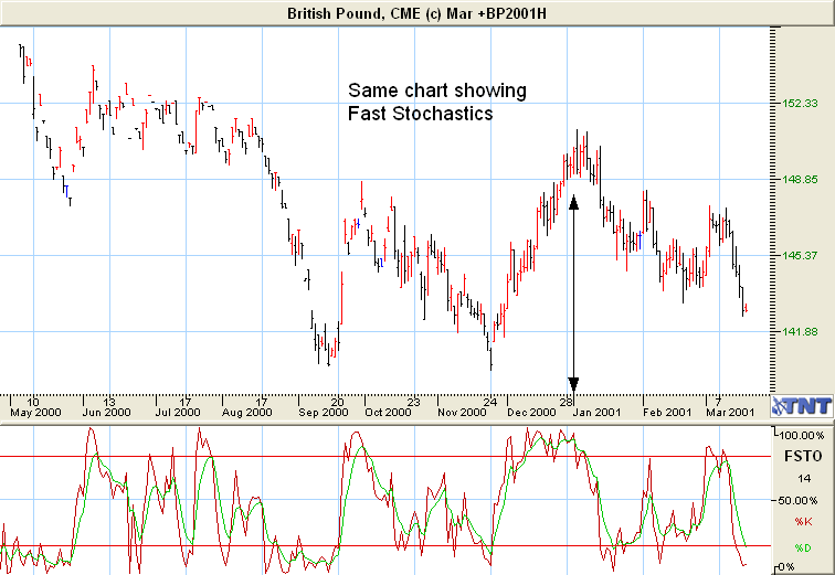
Let’s also look at the same chart and use Fast Stochastics indicator. Which one do you think is more accurate? I tend to use Slow Stochastics much more than I do Fast Stochastics, but that is a personal decision. You might like Fast Stochastics better. The major difference between them is that Fast Stochastics adds a more sensitive %K line. Most traders, including myself, like the Slow Stochastics better and feel it gives a more reliable reading.
The above chart is for the December contract, which is now over. Let’s take a look at the next contract month, March, and see what the price did. Could you have used Stochastics to help you know which direction the price may have gone?
Notice on the next two charts that the price continued to rally for a couple of weeks, and that Stochastics rose above 90, and it stayed there until the price started to drop. As soon as the Slow and Fast Stochastics Lines dropped below 90 and crossed, the trend reversed.
Again, I tend to think that Slow Stochastics is a little more reliable indicator, but then again it’s a matter of personal preference and you should look at many charts and decide for yourself which indicators, if any, you like to use in your trading plan.
Williams’ Percent R:
This indicator is commonly referred to as “% R” and it was developed by Larry Williams. The scale used is upside down of the scale used for Stochastics by the way. It’s a variation of Stochastics Fast %K. Where %K compares today’s price to the lowest past prices, %R compares today’s price to the highest past prices. %R will produce a buy signal when the indicator is high (above 80) and will produce sell signals when it is low (below 20).
Let’s take a look at the following chart using the %R indicator and see what the chart looks like with it. %R works best in trending markets so don’t rely on it in choppy markets like a Trading Range.
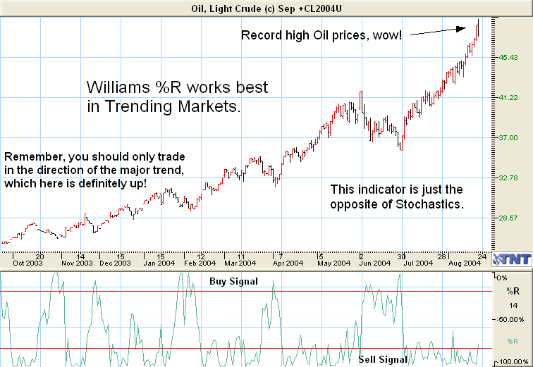
How many times did the price rally when the indicator hit –80 and how often did prices drop when it went to –20? Can you see how you could use this along with Stochastics?
Are you beginning to see the value of using these indicators along with doing your own chart analysis. I hope so.
Williams’ Accumulation/Distribution Index (AD):
The Williams’ Accumulation/Distribution index (AD) study attempts to measure market pressures. It specifically looks for market formula. The study serves to measure market strength and sentiment. You can use the normal technical tools on the study, i.e. trendlines, breakouts, support & resistance. However, you must watch for instances of substantial divergence from the AD index versus the underlying chart as the key to future price direction.
If the market continues to stampede into new high ground, the AD study should follow suit. When the market makes several new highs but the AD fails to make new highs, it is a warning signal of a market about to reverse direction. Conversely, a buy signal occurs when the AD fails to make lower lows while the market price drifts to lower levels. In either case, divergence implies a reversal in the dominant trend may be near.
Once you spot divergence, initiate a market position when you spot a clear break in the trendline of the AD index. This minimizes the possibility of taking a position before the actual trend reverses.
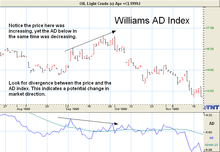
On the above chart, the price during September and October was increasing, yet the Williams’ AD was not showing the same increase. As a matter of fact, it headed lower during the same period. This is called divergence, and you can find it in many of the momentum indicators. To me this would indicate a weak rally, and that we might soon see a drop in the price. As you can see, it did just that.
RSI or Relative Strength Index:
RSI was developed J. Welles Wilder and it’s a very popular technical tool. It is a momentum oscillator that measures the velocity of price changes. There are several different ways to interpret its signals. Most traders use 14 days as the oscillator for Daily Charts.
Any value (line) above 70 is an indicator of an overbought condition and any value (line) below 30 indicates an oversold condition. (see glossary) The following chart shows the RSI. Let’s see how to use it to our advantage by looking at when the RSI gets close to 70 or exceeds it, or drops to about 30 or below.
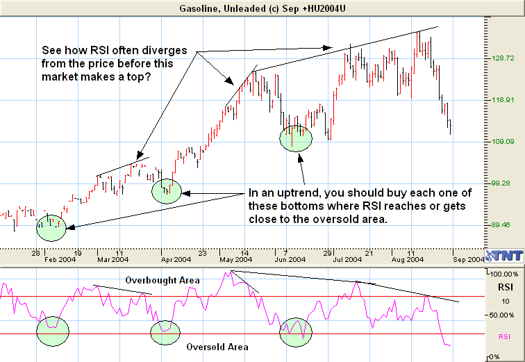
As you can see, during this uptrend each time the RSI indicator dropped near to or below the 30% (Oversold Area) the price rallied. The typical Buy signal would be to wait until RSI dropped below 30% and Buy when it moved back above the 30% line, and the same goes for selling after RSI moves above 70% and drops back down. However, in the case of the uptrend in Gasoline above, RSI didn’t reach the oversold area and you would have missed out on a couple of good chances to enter this market. Only use this in Trending Markets, and trade in the direction of the trend. Also use this along with the other indicators and your own trading plan too. Don’t use it as a “stand alone” signal.
RSI On The Weekly & Monthly Charts:
It’s important to watch the RSI level on the Weekly and Monthly charts, too. Daily charts are much shorter-term pictures of the market than the Weekly charts; therefore, Weekly charts carry much more importance than the Daily charts alone. The strongest buy signals are when both the Weekly and the Daily charts cross above the 30 level and the strongest sell signals are when both charts fall below the 70 level.
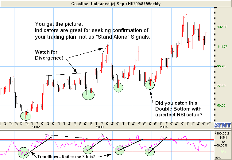
Plot Trendlines On The RSI Charts, Too! Just like you would draw trend lines on a bar chart, you can draw trend lines using the RSI levels as well. I did this so you can see how this could be of help. Like in all momentum oscillators, look for a divergence.
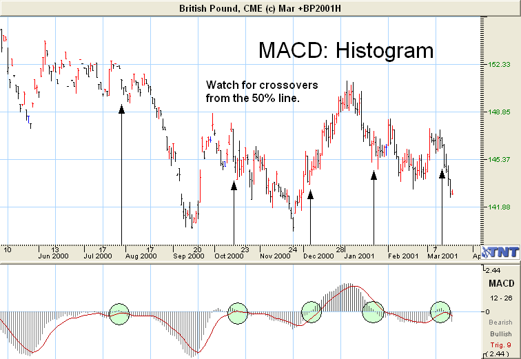
Moving Average Convergence/Divergence: MACD
The MACD is one of my favorite indicators. I use it all the time and find it to be extremely reliable most of the time.
MACD Histogram: MACD stands for Moving Average Convergence Divergence and is an oscillator based upon exponential moving averages. This chart uses a long-term, 26 week average and a short-term 12 week average. The difference is then calculated into a 9 week average.
Look for divergences in price pattern and trend. This is when the price is making a new high or low, and the MACD is going in the opposite direction or not confirming the move. We will discuss divergence and how to apply it more later in the course.
The following chart displays the MACD as a histogram.
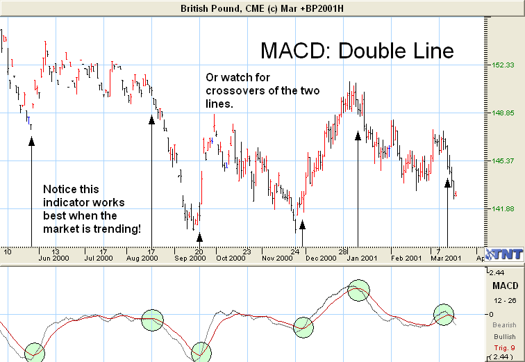
MACD Double Line: This is the same oscillator except it’s shown in double line form. Remember, Momentum indicators work best in trending markets, not sideways markets.
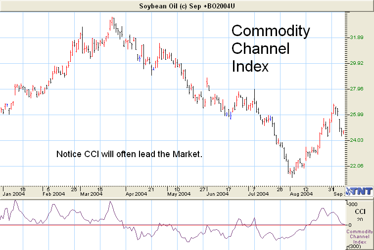
Commodity Channel Index (CCI)
This was developed by Don Lambert with commodities in mind but works well for stocks, funds and indices too. It’s calculated by looking at the mean price vs. its average price over X period of time. The result is then shown in a trading range of +100 or –100.
CCI is a leading indicator and shows what the market “should” do. Like all leading indicators when it’s right it can produce very profitable results for you. However, it will be wrong quite often. Use it as an early warning sign and wait for confirmation from other indicators.
Volatility Studies
As the name implies, volatility studies deal with how volatile the market is at any given time.
Bollinger Bands
This is a popular indicator with most people. You will often hear mention of price bands or envelope bands. The way they derive it is to take the Moving Average (you will learn about it soon) plus a given percentage to get the top band. The lower band is derived the same way, the Moving Average minus the same percentage.
Most of the time, these bands provide a good indication of support and resistance levels. Another way to look at Bollinger Bands is to think of it as reflecting overbought and oversold conditions. It would be an oversold condition if it breaks out the bottom.
Let’s look at a chart, the same one shown above except it’s showing the Bollinger Bands. How does it compare?
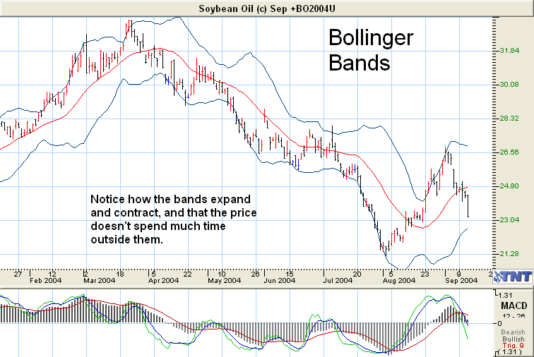
Notice how the prices tend to bounce off the top and the bottom of these bands. Just think for a moment on how you could use this to your advantage.
There are many more in depth ways you can use Bollinger Bands to help with your trading, and probably the best book to read is by the man who invented them, John Bollinger. His book is called “Bollinger on Bollinger Bands”.
Directional Studies:
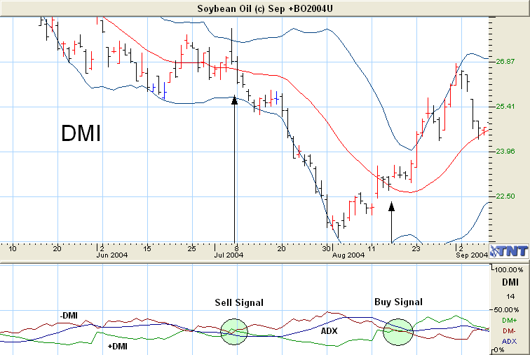
DMI
The Directional Movement Indicator was developed by J. Wells Wilder and introduced it to the public in 1978. This is a very strong indicator of trend, trend direction, and any impending trend reversal.
The indicator is composed of three values: +DI (shown on the chart as a thin solid line) is a measurement of positive movement; -DI (shown as a dashed line) measures negative movement; and the ADX (heavy solid line) measures the strength of directional movement (the stronger the trend up or down, the higher the ADX value).
Out of all the different indicators, this is probably the most intimidating one. It shouldn’t be as the interpretation is pretty easy. When the +DI line crosses above the –DI line, a long position is taken. When the –DI crosses above the +DI the position reverses and a short position is taken. Trend reversals usually occur with the first down turn of the ADX after the ADX has crossed above both of the DI lines.
Let’s look at the same chart we used for Bollinger Bands (except it will show just the last two months) and see what the difference is.
Moving Averages
Moving Averages help us know when a trend has reversed. The way they work is that you take two different time frames (I used 10 and 30 days for this chart) and calculate the average price during each of these time periods. As an example, a 10-day average takes the average price over each of the last 10 days, adds them together and divides by 10. (They refer to the shorter time frame as the Fast Moving Average.) The resulting number is that day’s average. The same thing is done to get the 30-day average (The Slow Moving Average) except it adds the average price over the last 30 days, adds them together and divides by 30 to get that day’s average.
The most common method of analyzing Moving Averages is to look for crossovers of the two ranges. As an example, when the 10 day, faster moving average, crosses over the longer term slower moving average, a crossover has occurred.
A sell signal is generated when the 10-day, faster moving average crosses below the longer-term 30-day, slower moving average. A buy signal is generated when the fast moving average crosses above the slow moving average.
These days, using a computer and charting software, you can use it to set up any time frames you want. It could be a 5-day and 60-day setup if you like. I tend to use 10 and 30 period time frames myself, and a 9 for the very short and 200 for the long term (Depending on what and how you are trading). Most will give you fairly accurate indications of when the trend has changed. Keep in mind that Moving Averages work best in trending markets! Also, by their very nature, Moving Averages lag behind what the market is actually doing. They usually confirm a trend change rather than predict a trend change.
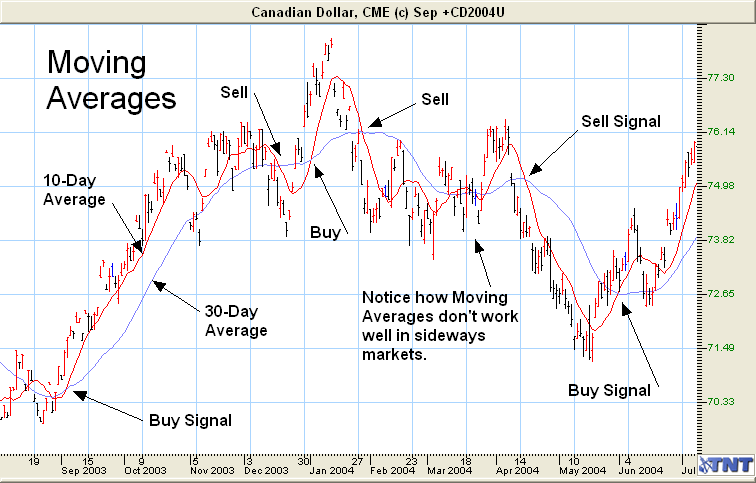
As you can see, on the chart above these cross-over points were fairly accurate. Remember Moving Averages should be used in conjunction with other indicators and chart analysis techniques that you have and will learn. I use them to confirm what I believe has happened based on my chart analysis.
I sometimes trade at the crossover points, as they seem to be a reliable indicator for me; papertrade it yourself and see.
Keep in mind, when you think there may be a trend reversal based on 123’s, breakouts, etc., always take a look at the volume, as well as the other indicators, to get a second opinion.
Trend Studies
Identifying the trend and the magnitude of the trend are the keys to chart analysis. This is what Trend Studies attempt to do. They can be very valuable.
Computer Generated Trend Lines
While the computer may be great at many things, I don’t feel that drawing basic trend lines is one of them. I think there is no better tool than the human eye to do this.
All charting programs that I’ve seen allow you to draw trendlines, Including Gecko Software’s Track ‘N’ Trade Pro. They will also let you write on them, put in little flags, arrows, boxes, circles, etc. I could go on and on about this piece of software, but you have already seen many things it can do as all the charts in this course have been created using it.
Gann Lines and Gann Angles
Books have been written about Gann Lines and Angles. There is no way to fully describe this theory here, so I’ll just give you a brief description and a couple of charts to look at. If it’s of interest to you, you can find dozens of books on the Internet.
William Gann (1878-1955) developed a unique combination of geometric and mathematical principals, which he applied to trading stocks and commodities. The proportional relationship of time to price was the basis for much of his work.
Mr. Gann gave special importance to 3 sets of numbers. One is the number 7 and it’s multiples (7, 14, 21 etc.) and he gave special significance to 49, the square root of 7 and also to 77. He stated that the 49th day, week or month from a previous top or bottom would project a trend reversal. It’s interesting that he lived to be 77 (I think he planned it that way).
He also considered the number 12 and its multiples important. Example, there are 12 months in a year, 24 hours in a day, 60 minutes in an hour and 60 seconds in a minute and 180 and 360 degrees.
His third set of numbers is the harmonics of the circle, 30, 45, 60, 90, 120, 135, 150, 210, 225, 240, 270, 300, 315, 330 and 360, all relating to day’s weeks or months. It’s odd that over 30% of all numbers will fall into one of these categories, which has brought much skepticism to his statistics.
Two parts of his theory seem to have important correlation to price movements in both stocks and commodities. These are the Gann Lines and Gann Angles.
Gann Lines are potential retracement levels that are generated by dividing a market advance or decline into eighths and thirds. He contributed the most significance to the 37.5%, 50% and 62.50% levels. These are also Fibonacci numbers that we will talk about next.
Next, price and time come together in Gann Angles, which project trendlines from important tops and bottoms. All Gann Angles are quoted in a price to time relationship, like 1×8. This means a move of one unit of time to the right and 8 units of price, up or down. The angle representing price and time in balance is 45 degrees, which he felt was the most important angle.
Important turning points are often found when Gann Lines and Gann Angles meet.
If all of this is confusing, I’m sorry, but you may find it useful in your chart analysis when you become more familiar with it. Be sure to read more books and information regarding this theory, if you want to use it more effectively.
Below is an example of a Gann chart to at least give you an idea about it.
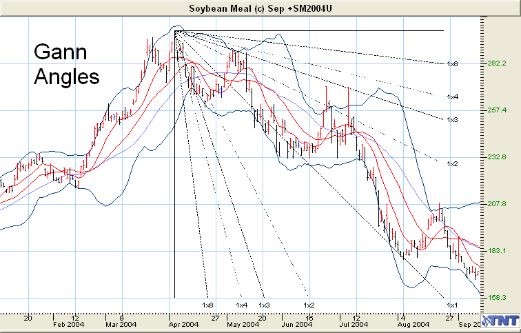
Notice on the chart above, that the trend started out strong following the 1×4 angle, and after slowing the price found support at the 1×3 angle. After bouncing up to the 1×3 resistance area the downtrend continued, and for the most part moved along at a 45 degree descent. The closer the price stays to the 1×1 (45 degrees) angle, the stronger the trend is. Trends that move sharply up or down at say the 1×8 or 1×4 angles don’t usually continue very long and almost always reverse trend again.
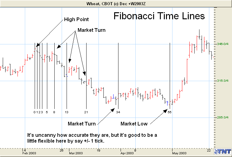
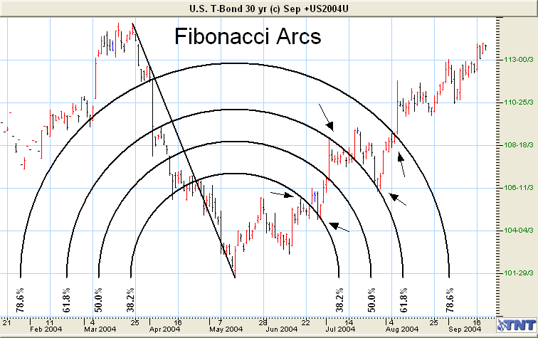
Fibonacci
Like Gann, there are many books about this theory. This is just a brief overview.
Leonardo Fibonacci lived in Italy in the thirteenth century. His work on the relationship of mathematics and nature has been applied in physics, astronomy, as well as engineering. Much of his work was done studying the Great Pyramids of Egypt. Many great traders believe that his principals apply equally as well to the markets and market psychology.
(For you math types) the Fibonacci number sequence is created by adding the last two numbers in the sequence to the next number. (i.e.1, 1, 2, 3, 5, 8, 13, 21, 34, 55, 89, 144 and on to infinity). The first three numbers are usually dropped for analysis purposes. These number sequences create some interesting mathematical relationships. The most commonly used sequences are: the ratio of any number to its next higher number which approaches a constant value of .618 (i.e. 34/55=.618); the ratios of alternative numbers which approach a constant .382 (i.e. 21/55=.382, 34/89=.382).
These number series and their ratios are used to create four indicators. They are Time Lines, Ratios, Fan Lines and Arcs.
Time Lines are vertical lines drawn at Fibonacci Intervals from the significant high or low of the trend. In theory, future turning points should coincide near these time lines.
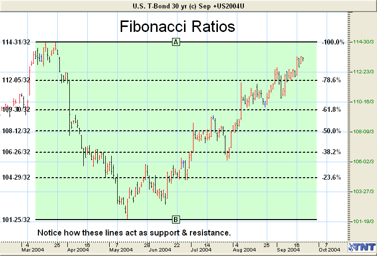
Ratios: You can use Fibonacci Ratios just like you would a 50% level tool. There are 5 levels of retracement, and they are 23.6%, 38.2%, 50%, 61.8%, 78.6% and 100%. The idea is that if it breaks one level, then it will probably proceed to the next level and find support or resistance there. If it breaks the next level, it will then head to the next level and find support or resistance there.
On the following chart, you can see that it did just this. The price broke through the 23.6% line, but couldn’t find support and dropped back below it. On the second try it finally did find support, which looks like it became a CN, and the price shot through the 38.2% line and hit resistance at the 50% line.
After the price pulled back to the 38.2% support level, it rose forcefully up to the 78.6% level, but ran out of steam and bounced around between the 78.6% and 61.8% levels. Then after a failed attempt to break the 78.6% level, the price is finally heading up to attack the 100% level, and possibly on to new highs.
Remember, contract highs are the strongest resistance area, so I think it will have a little trouble getting through the first time, and may need a considerable pull back or time to consolidate.
Fan Lines are drawn using the same ratios as before, .786, .618, .50, .382, and .236 from the same high and low point on the chart. Fan lines are then drawn connecting the dividing points of each ratio along the Fibonacci Ruler.
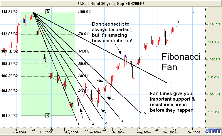
Arcs combine price and time to display expected containment of price action over time.
Andrews’ Pitchfork (Tridents) is a study that is composed of three lines resembling a pitchfork or trident. The outer two lines for a parallel channel based on a significant high and low. The third line divides the channel.
Let’s take a look at a chart with Andrews’ Pitchfork drawn on both the Short Term and Intermediate Trends.
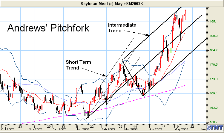
As with all trend studies, the idea is to project support and resistance levels into the future.
Trading is like putting a jig-saw puzzle together. When you first open the “box” you probably can’t tell what the final picture is going to look like. The things you have learned in this course are the pieces of the puzzle. Keep learning what the pieces mean, putting them together and papertrade them over and over again, and one day soon they will become clear to yo