
The Bar Chart
Dates at the bottom: Days of the week. It starts on Monday, ends on Friday and shows prices daily, except for certain holidays and weekends.
Vertical Prices: The price is represented in a variety of different ways depending on the market. These prices are listed on the right side of the chart, and also can be found under the KEY tab of the software.
Bars: The prices are reflected each day via a “bar”. This is where we get the name “bar chart.” Below is how to read a “bar.”
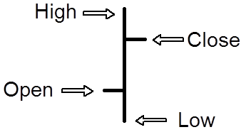
As you can see there are four different prices reflected here. The first is the “Open.” This is the price that it opened for trading that day. The next is the “Low.” This is the lowest price it traded for that day. Next is the “High” or the highest price it traded for that day, and last we have the “Close”, or the last price paid that day. Many people feel the closing price is the most important price of the day.
The reason being that every day, there is a battle going on between the bulls and the bears. The bulls want to see the price go up and the bears want to see the price go down. The closing price shows you who won that day.
Japanese Candlesticks
Candlestick charts are created using the same OHLC data as bar charts, but are by far more visually appealing and price relationships can be seen much easier. Also, they provide a clear view into the current trading psychology of a particular market not readily available with other types of charts. Since they use the same OHLC data, they can be applied to stocks and commodities just as easily. Like traders seeking recurring chart formations in bar charts, candlesticks also create specific patterns.
First, let’s take a look at a standard candlestick. Incorporating the same OHLC data, a white (bullish) candlestick appears when the closing price is higher than the open, and a black (bearish) candlestick is shown when the price closes lower for a given time period.
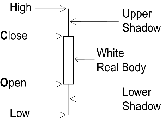
Bullish Candlestick
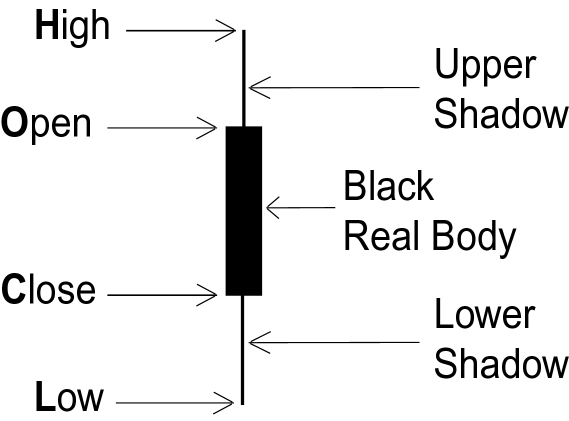
Bearish Candlestick
- Real Body – The body of a candlestick represents the price range between the opening and closing prices.
- White Real Body – When the real body is open or white, the price closed above the open and is normally seen as bullish.
- Black Real Body – A black or filled in real body appears when the close is lower than the open, and is considered bearish.
- Upper/Lower Shadows – The thin vertical lines above and/or below the real body are called the upper/lower shadows. They represent the high/low price extremes of a given time period.
Now let’s see what the same data used to construct a bar chart looks like on a candlestick chart. See how the candlestick chart almost jumps off the page!
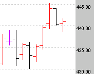
Bar Chart
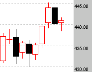
Candlestick Chart
As you can see the battle between the bulls and the bears becomes quite apparent on the candlestick chart.
Looking At The Markets
There are three “views” for each commodity.
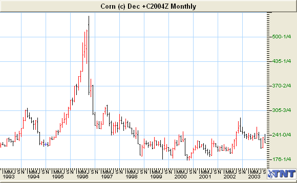
Monthly: The longest- range view is the Monthly chart, which shows the price movement over the last 10 to 20 years. Each vertical line, called a “bar” on this chart represents one month’s prices. The Monthly chart is very important to get a long-term view of price movement over a period of many years.
Take a look at the Monthly chart below. It shows the price of Corn over a period of 10 years. As you can see, the highest price was about $5.54 a bushel in 1996 and the lowest price was $1.76 a bushel in mid 2000.
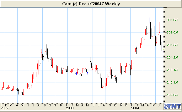
Weekly: The next view is the Weekly chart. It shows the same information as the Monthly chart except it is for a shorter time frame and shows the price fluctuation week by week. Each “bar” represents one week’s prices, just like the Monthly chart represents one month’s prices.
The Weekly chart will also prove to be invaluable in planning your long-term trades. Later, I’ll show you how to use both of them.
Take a look at the Weekly chart for Corn below. As you can see, the lowest price on the chart is $1.92 and the highest price is $3.35.
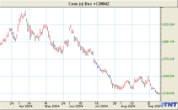
Daily: Let’s look at the Daily chart for December 2004 Corn on the next page.
Each commodity trades in a specific contract month(See the list by clicking on each market in the software). This particular chart is for December 2004 Corn. This means, when you place an order for Corn, you would instruct the Broker which contract month (delivery month) you wished to buy or sell a contract in. As an example, the following contract for December 2004 Corn started trading back in January 2002 and expired 24 months later.
Now, you might want to trade another contract month that is “further out,” a more distant month, like March 2005 Corn. We will discuss the pros and cons of doing this later in the course. For now, I just want you to understand the different “views” that you can see of a particular commodity.
There are a few terms that you will need to become familiar with also. Often these will be shown in the Key of the chart.